What's The Bright Idea?
I like experimenting with my camera in an attempt to get the best Straight-out-of-camera (SOOC) shots I can. A lot of my motivation behind pursuing good SOOC pictures is to avoid so much time editing them to my satisfaction. Unfortunately my pictures almost always require at least a little bit of editing. I do have to say though, when time is available for it, editing pictures is a fun way to experiment with your creativity.
Spending many hours 'gimping' my pictures in not uncommon. When that much time is invested in creating a visual 'masterpiece' (granted "eye of the beholder"), nothing blows the wind out of your sail like finding out bad your picture looks on another computer.
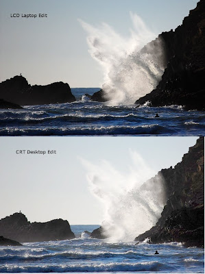
Case in point, below are some pictures I edited to have a visually-pleasing contrast to brightness ratio...not too bright, not too dark and not too washed out. I originally edited the pictures on my LCD laptop screen.
Feeling pretty satisfied with how the pictures looked, I was disappointed when I saw them on my CRT desktop monitor.
So I decided to edit them on my CRT monitor, compare them side by side.
If the pictures look so much different of different computers, how can I be sure they look the same when I get them printed on photo paper? My wallet certainly isn't willing to find out the answer.
CRT monitors, my preference, probably have a more consistent picture, but are often dark. LCD screens are nice and bright; maybe even too bright causing whites to glare and textures to disappear--even if they are high definition screens. One of my pet peeves with LCD monitors is that their picture quality varies depending on one's view-angle to the screen.
So here is the picture editor's dilemma: how can you guarantee a good-looking picture on various viewer's computer screens? More importantly, how can you know your edits will look good when the picture is developed?
I'm not sure there is a guarantee, but I have learned a few tricks.
1. Trust the photo-editing software's 'judgment' of a good edit as a reference point. More than likely your picture-editing software has buttons that automatically balance the contrast/brightness and colors. I also use the histogram to help me know how to trim the brightness and the contrast. Sometimes I use Gimp's Levels eye-droppers to make whites white or grays gray. Unfortunately, relying on the software is no guarantee you will have a good-looking picture. Relying solely on the software can also dampen creativity. Although I've learned to trust the software, I only use it as a reference point--not an end-all solution.
2. Calibrate your monitor's contrast, brightness and color to a standard reference. Many Disney and other DVDs contain a monitor optimization tool in their setup menu. This tools walks you through a step by step process to change your TV and monitor settings to optimize the picture quality. Especially for LCD screens you may need to use the advanced display settings to get a decent configuration.
I recently found a free software program, Calibrize (http://www.calibrize.com/), that walks you through a screen configuration wizard then saves the settings allowing you to simply click a button re-optimize your configuration. This program recommends recalibrating your monitor every two weeks. I am planning to recalibrate every time I edit pictures on my laptop to compensate for whatever angle it has when I open it up for that session. Some non-free software, to justify a consumer's financial sacrifice, may do a better job of optimizing your screen. In any case, free or not, I strongly recommend researching a product before investing in it.
3. Purchase a monitor built to provide true color and light balance. Using one of these screens is probably the closest thing you will get to a guarantee that what you see on the screen will also come out on a print. Of course these are priced for professionals who see it as a necessary investment.
Maybe you have some tricks you've learned to make sure your pictures look great on a wide variety of monitors and, for certain, look good after printing.
Posted by
DMo
at
8:21 PM
0
comments
![]()
Labels: photography


